How to use the 60/30/10 rule in decorating
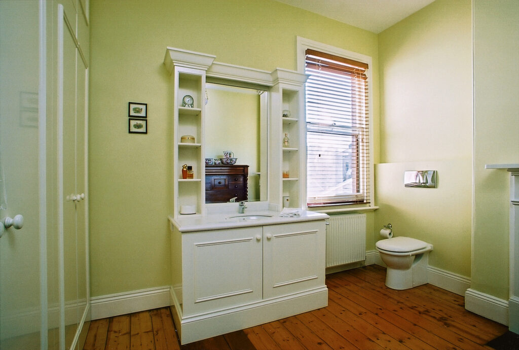
Would you like to be more adventurous with colour in your home but you aren’t sure how to start? One tried and tested approach is the ‘three colour rule” also called the 60-30-10 rule after the approximate percentages of each colour.
In this scheme, one base colour dominates – let’s call it your hero colour. A second colour which complements your base colour is used roughly half as much as the hero colour. Let’s call that the supporting act.
Lastly an accent colour is used to either add some high contrast or a different complementary tone.
So how does this work in practice?
Let’s say you choose green for your study. Painting the four walls green might comprise two-thirds of the colour in the room. Perhaps you have timber bookcases or lots of windows in which case you could choose other elements such as window coverings, a rug or a sofa to continue the green theme.
You use your secondary colour – say tan – for an larger pieces such as an area rug, an accent chair or curtains.
Lastly your accent colour – eg rust – can be featured on cushions, accessories like a throw pillow or an artwork.
One-colour, three intensities
The same proportions can be used in a one-colour (monochrome) schemes too. For example dark, medium and light shades of greige, a particular type of grey which has a warm undertone.
If you are doing a neutral or monochrome scheme I recommend that you should also think in terms of textures to add dimension. The same proportions can guide you, for example:
Hero colour – pale greige walls in a dead flat finish
Support act – nubbly area rug in coir, pale greige couch in a noticeable weave or a boucle fabric
Accent – gunmetal coloured side table or standard lamp
None of this is set in stone, and proportions can vary, but the goal is to create balance and at the same time variety which leads the eye around the room.
Colour trends
It’s important to choose a hero colour that you love and that reflects the mood you want to create, but don’t lose sight of the practicalities of realising your scheme in total. The interiors world is driven by trends just as the fashion industry is, albeit the trends run over a longer time frame. Thus you will find in every season some colours are easier to source and accessorise with.
At the moment, soft dusky pinks and sage greens are having a ‘moment’. Neutrals (cream, grey, beige, white) remain very prevalent. Putting a mood board together in these colours isn’t going to pose too much of a challenge as the products are readily available and the suppliers and their designers have merchandised everything to the ‘nth’ degree.
Fortunately there are alternatives but you will have to step away from the mass-market retailers and that’s where working with a designer will help.
Don’t settle
There is nothing worse then living with a bad colour scheme. Just because a colour looks great in a magazine article does not mean it will work in your home. I’m not a huge fan of digital mood boards although they have their place. Looking at colours on a computer screen is no substitute for real samples that you can handle. Some suppliers will make a small charge for sampling – but don’t be put off by this.
If you feel like you would like some advice, please do get in touch.